
Introduction
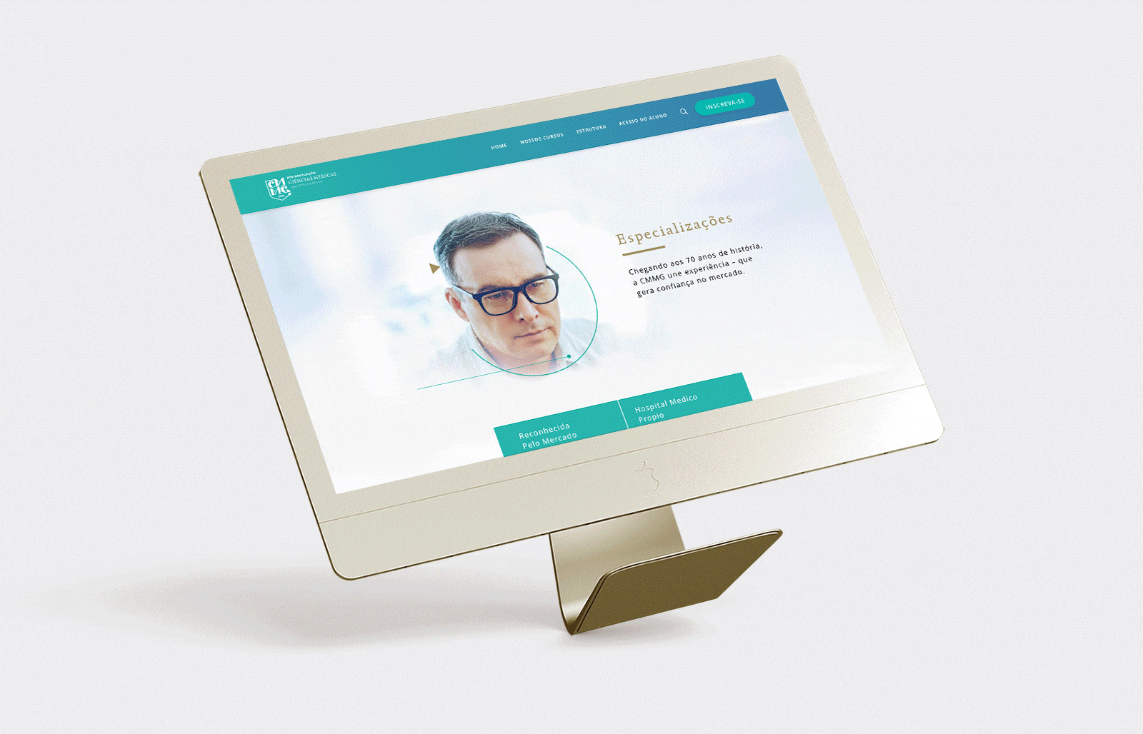
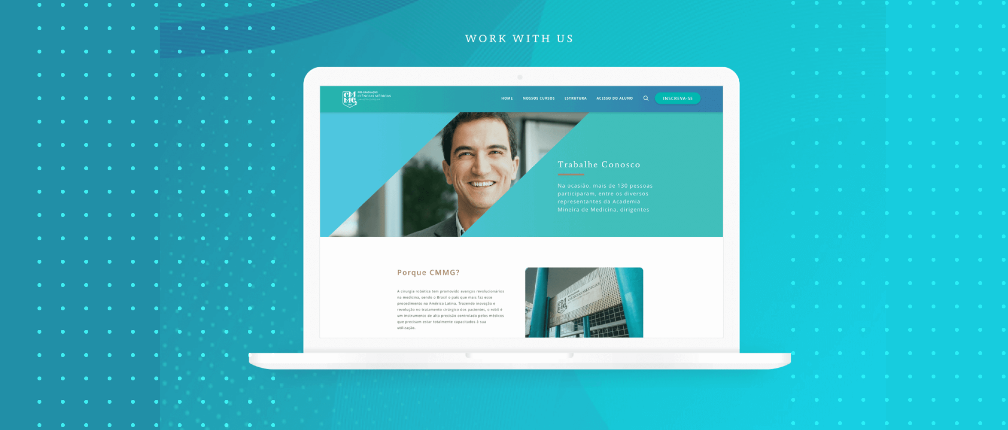
The Medical Sciences University in Brazil needed a complete redesign of their website to better promote and sell their postgraduate courses online. Their existing site was outdated, difficult to navigate, and generated very little revenue.
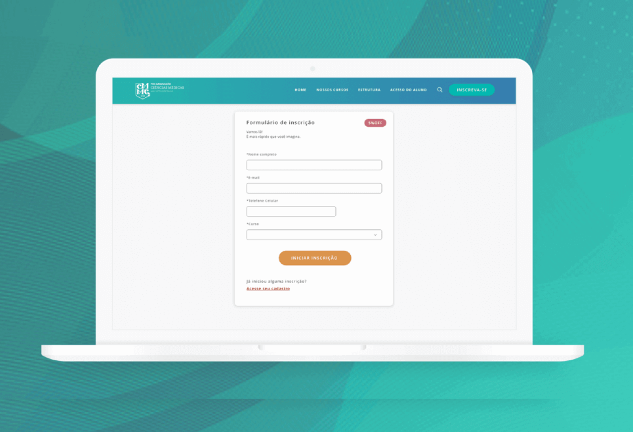
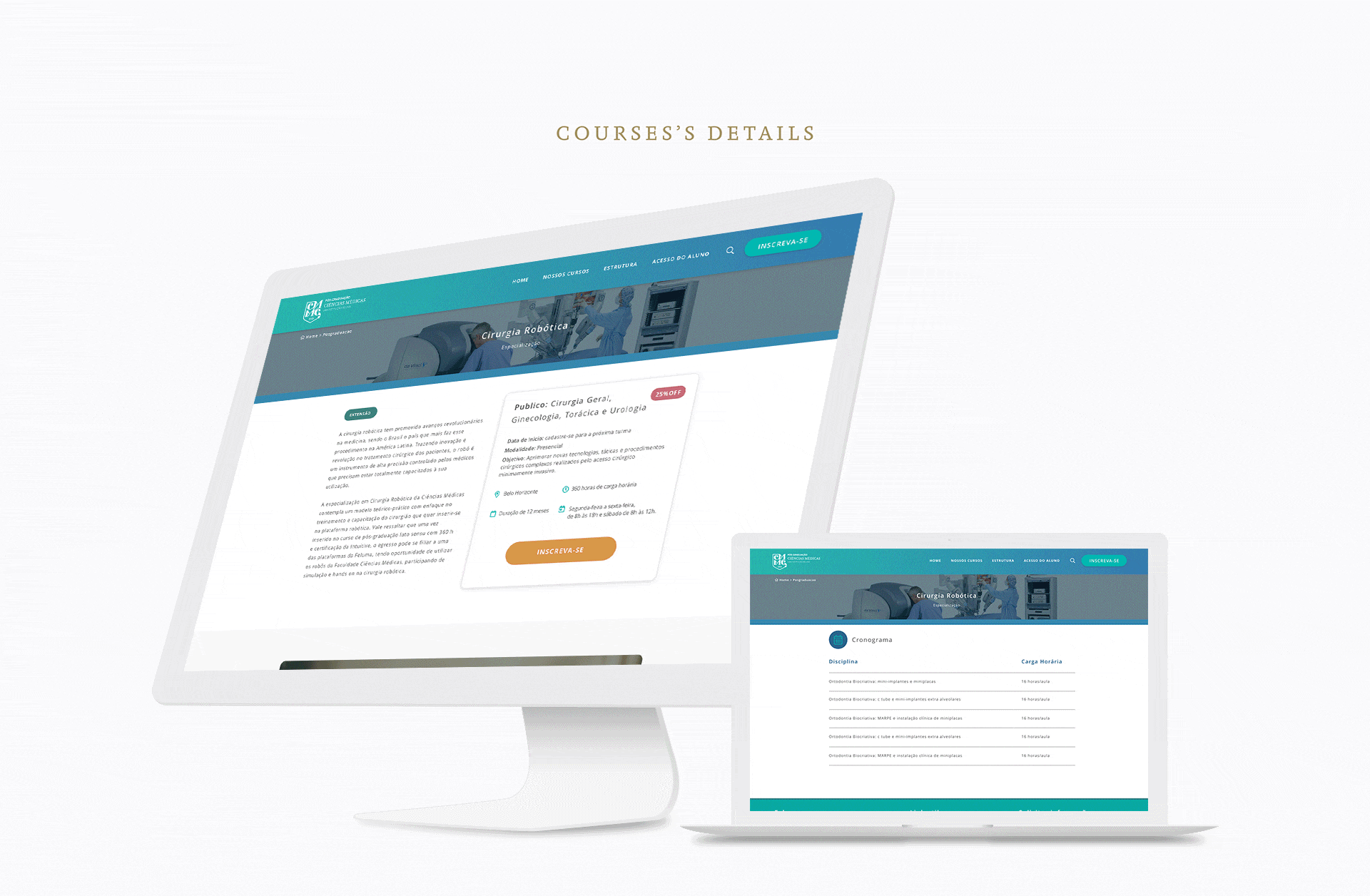
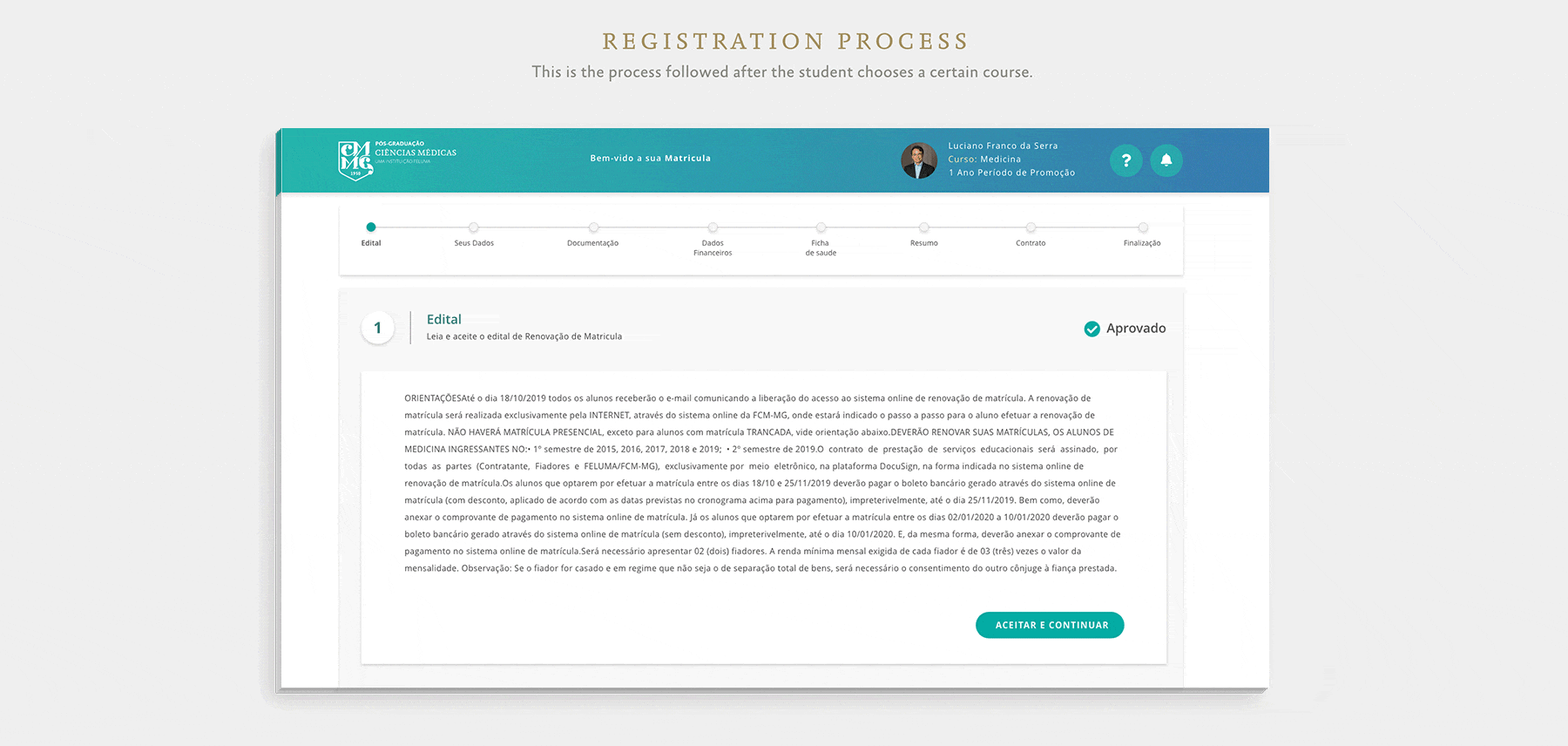
One of the main challenges was the purchasing process — users faced significant difficulties when trying to enroll in a course. The website was not responsive, meaning it only worked on desktop devices, and it lacked key information such as course details and pricing. Users had to complete a long form before even seeing the course fees, which led to frustration and drop-offs.
Main goals:
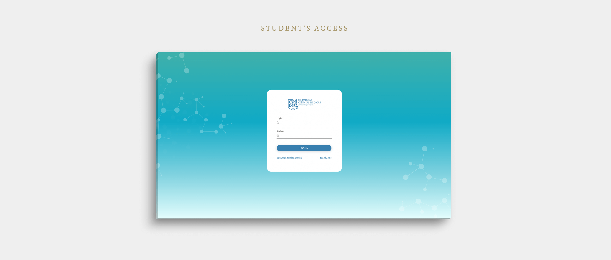
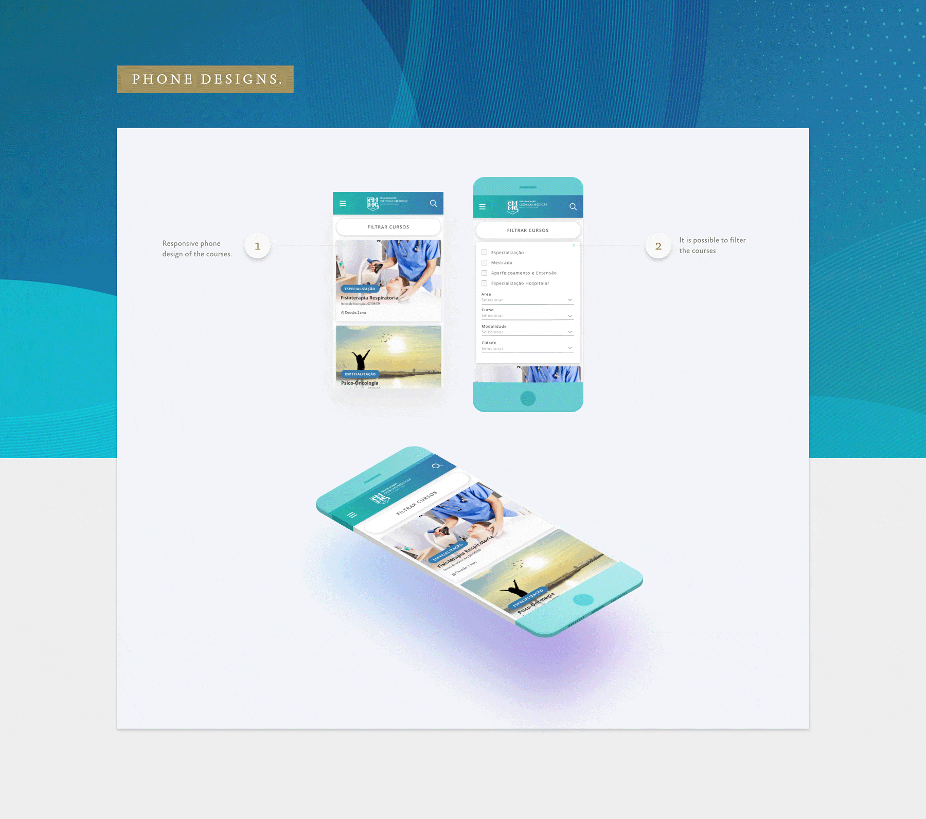
- Create a modern, user-friendly, fully responsive platform
- Enable prospective students to explore course options easily
- Provide clear, upfront information on course details and pricing
- Simplify and streamline the enrollment and purchasing process
- Reflect the university’s prestige and support busy medical professionals
The process
To bring this project to life, I followed a structured design process that guided every decision from research to final handoff. Below is an overview of the key phases that shaped the solution. Each step played a vital role in transforming user insights and business goals into a cohesive, intuitive digital experience.
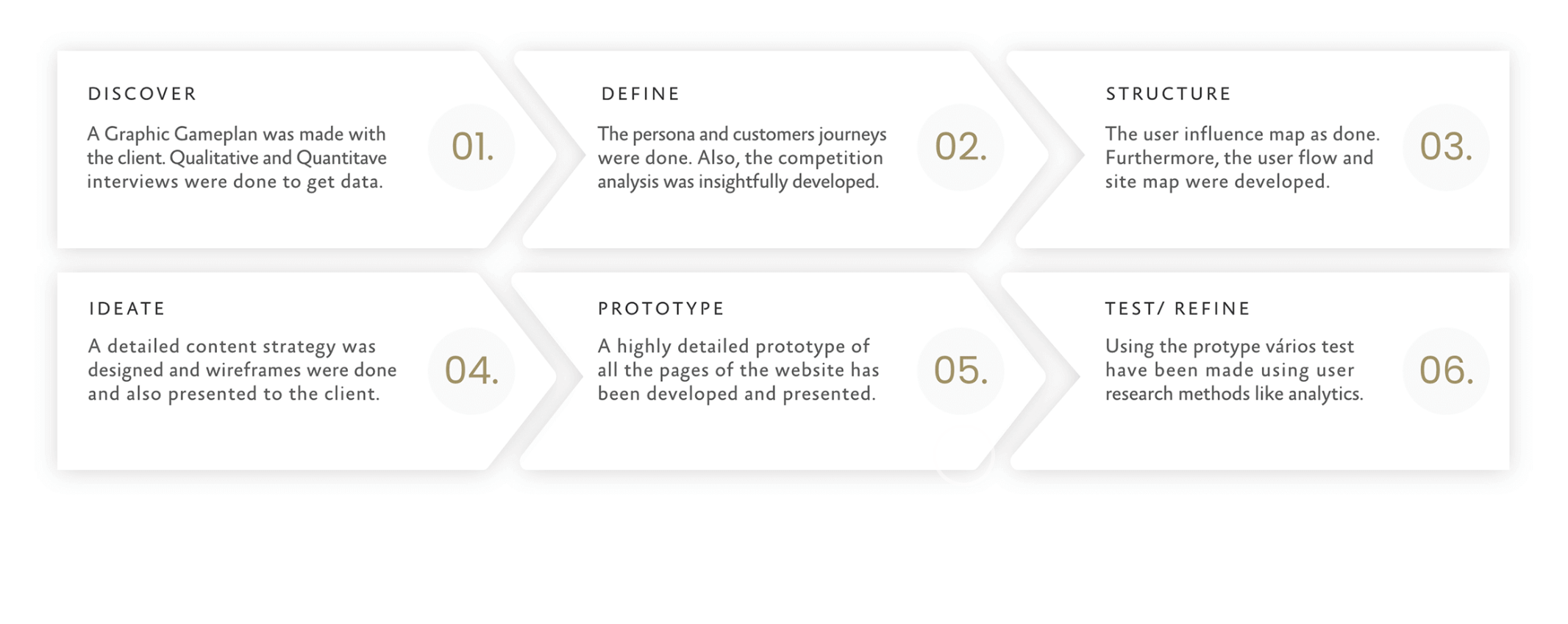
01. Discover: Understanding Users & Stakeholders
We started the project with a deep discovery phase to understand both business needs and user frustrations. By collaborating closely with the university’s internal teams, we aligned on goals, constraints, and expectations.
To gain a deeper understanding of our audience, we conducted in-depth qualitative interviews with students, doctors, and faculty members to uncover motivations, needs, and frustrations in their own words. We also gathered quantitative insights through surveys, which revealed user goals, behaviors, and pain points.
This combination of qualitative and quantitative research revealed critical barriers to course enrollment and helped us build a strong foundation for user-centered design decisions.
02. Define: Personas, User Journeys & Competitive Analysis
Using the research insights, we created user journeys and mapped the emotional and functional paths users took through the old site. We also performed a competitive analysis to study how other leading academic institutions approached similar challenges. This helped us identify key opportunities to make the experience distinctive—both in functionality and in design.
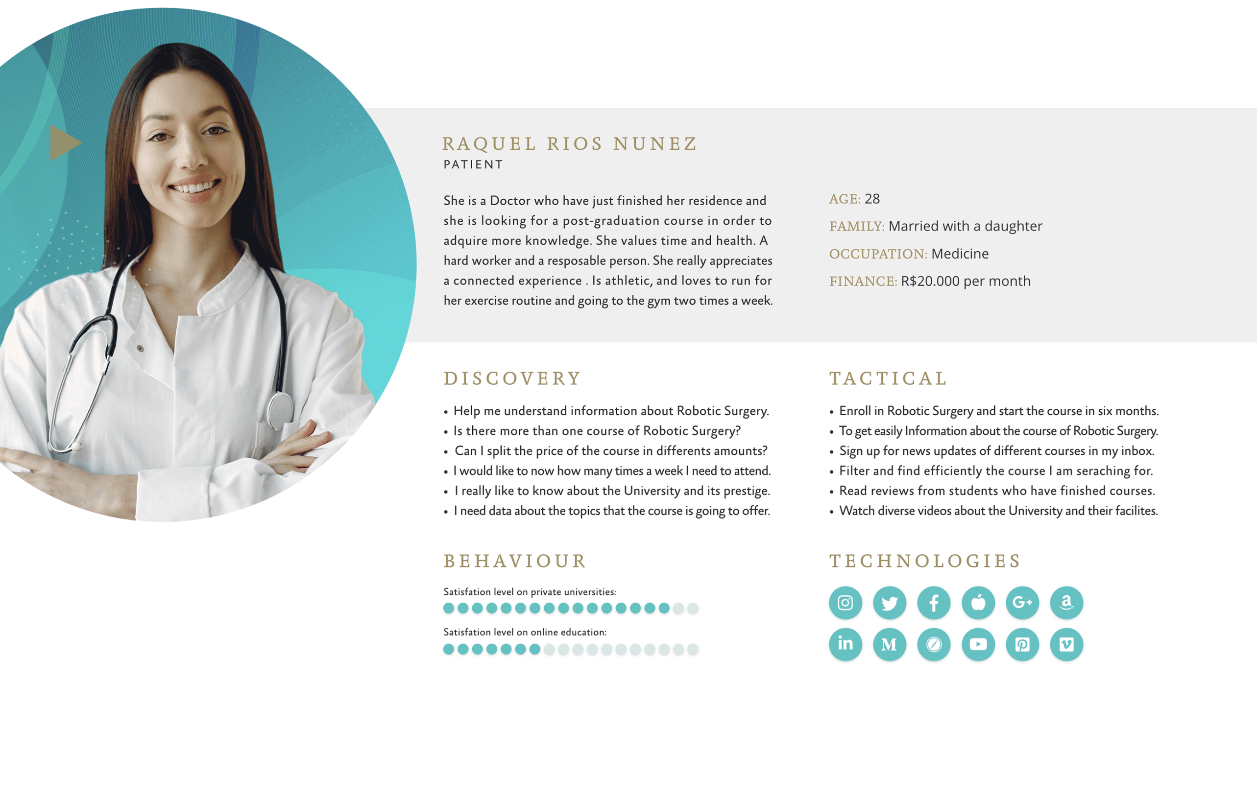
User personas
Based on patterns from interviews and data, we developed comprehensive personas that acted as north stars for the entire design process.
Raquel Rios Nuñez became one of our key personas:
- 28 years old, recently finished her medical residency
- Looking for a postgraduate degree in Robotic Surgery
- Needs upfront information about pricing, schedules, and certifications
- Prefers mobile-first access and a seamless application process
Raquel’s profile guided many of our decisions—especially around content hierarchy, mobile flows, and payment flexibility.
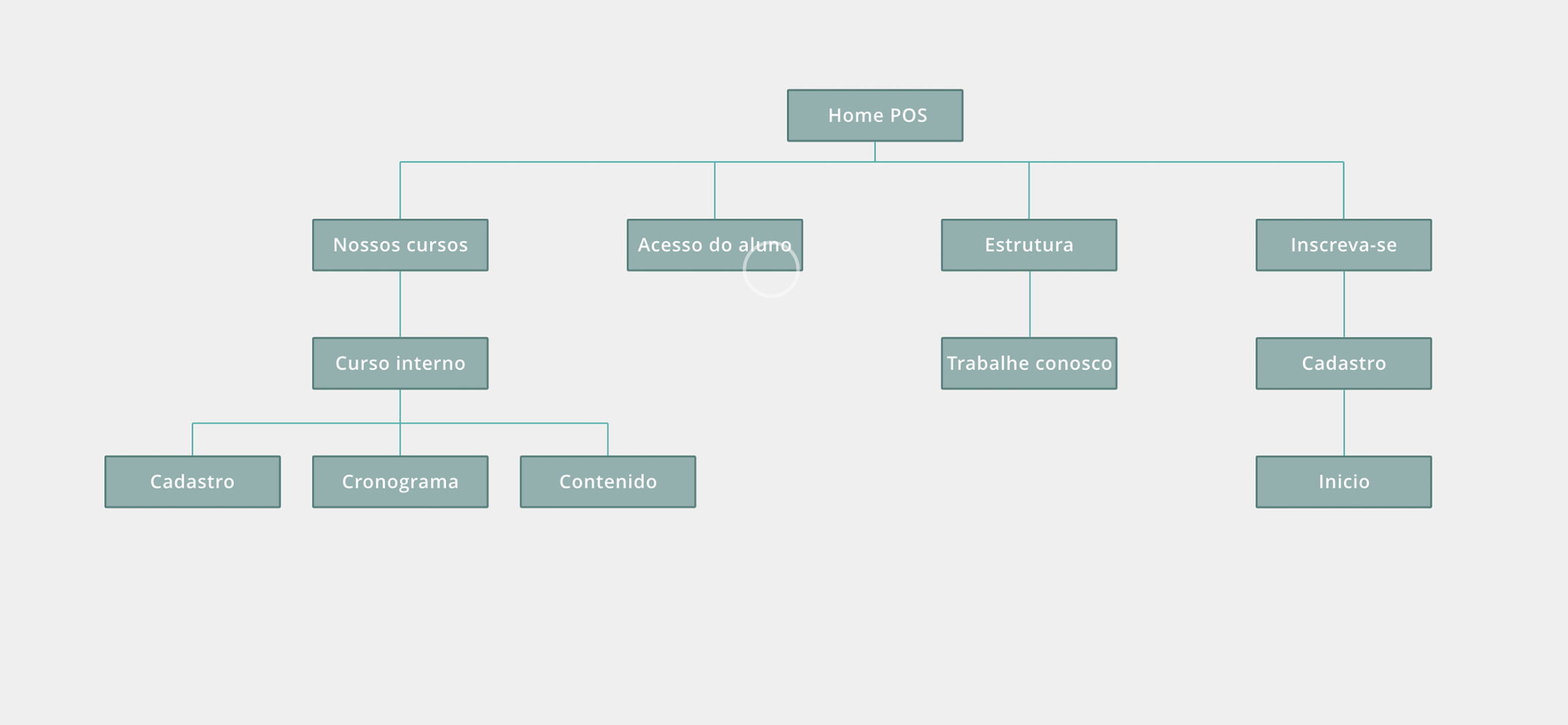
03. Structure: Sitemaps & User Flows
With a clear understanding of the audience and business needs, I created a comprehensive sitemap that laid out the structure of the new platform.
This map was essential for visualizing how users would navigate across various content types—from course listings to faculty bios and admissions information. It also helped ensure the information architecture was scalable and intuitive for every user segment.
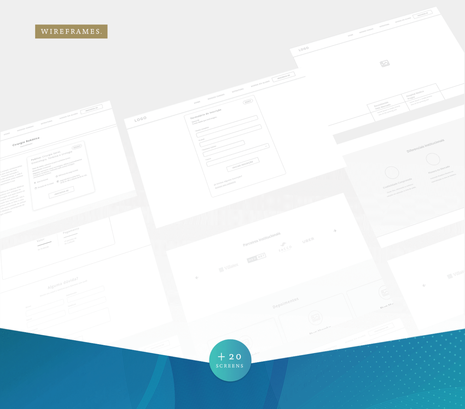
04. Ideate: Wireframes & Interaction Design
Wireframes were the next key step in bringing the structure to life. I designed wireframes to map out core interactions and flows, ensuring clarity and usability.
These wireframes allowed us to focus on function without getting distracted by aesthetics. They helped define:
- How users discover, compare, and enroll in courses
- Navigation logic and content hierarchy
- Interface behavior across devices
Wireframes were shared and discussed with the university’s comms and IT teams, leading to continuous refinements based on real-time feedback.
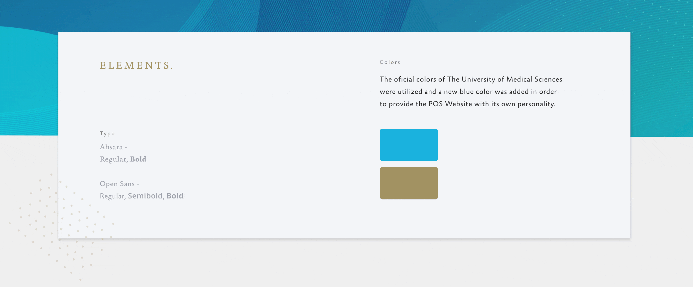
05. Visual Design: Colors, Icons & Typography
Once the wireframes laid down a solid foundation for the website’s structure and interactions, I moved on to crafting the visual identity that would bring the interface to life. This phase involved carefully selecting the color palette, designing custom icons, and choosing the perfect typography for both body text and titles.
The colors were chosen not only to create an inviting and professional atmosphere but also to enhance usability by guiding the user’s attention and creating clear visual hierarchies.
Typography played a crucial role in establishing the tone and readability of the content. I selected typefaces that balanced clarity with elegance, ensuring that both titles and body text were easy to read and visually harmonious across all devices.
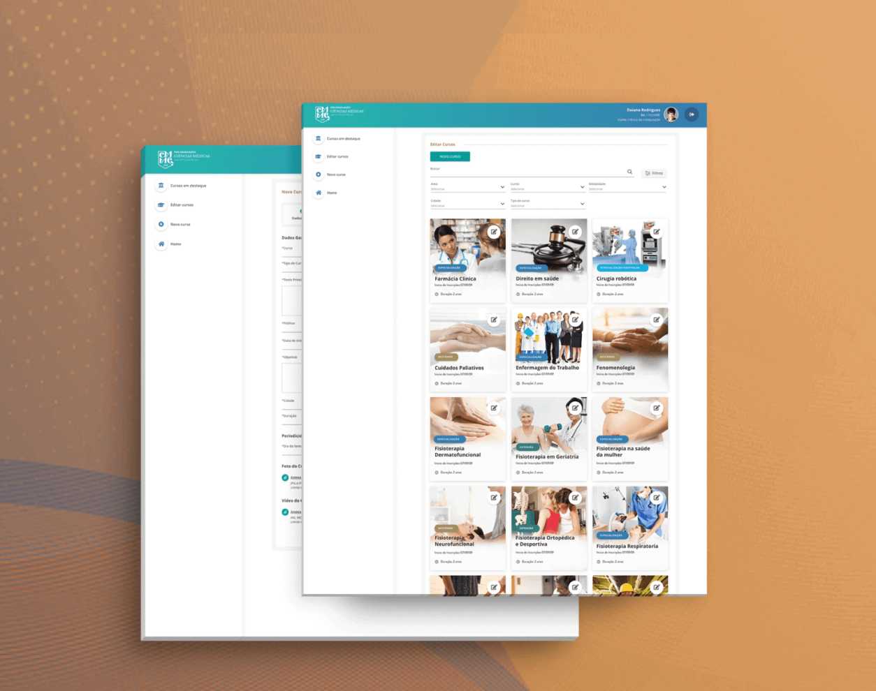
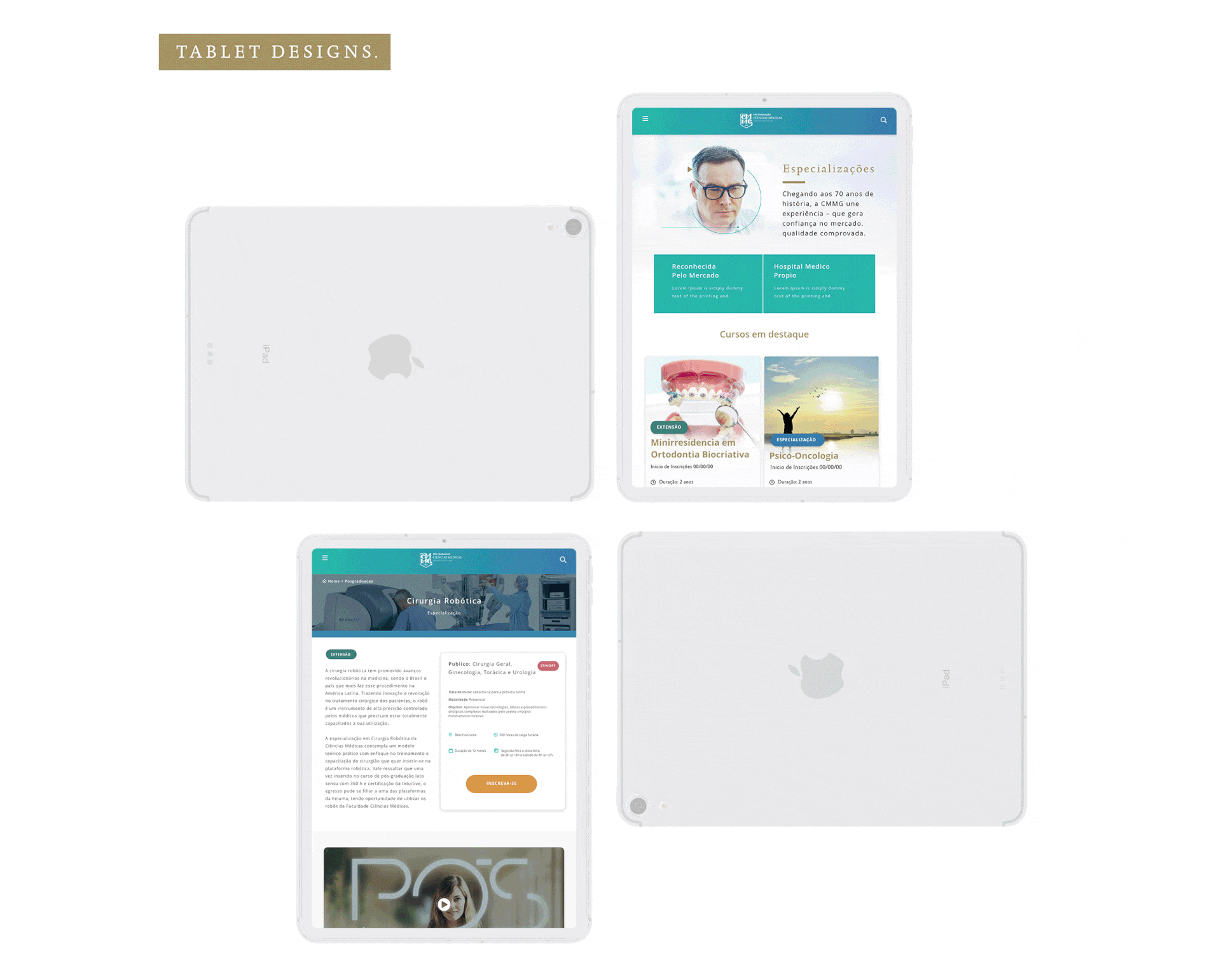
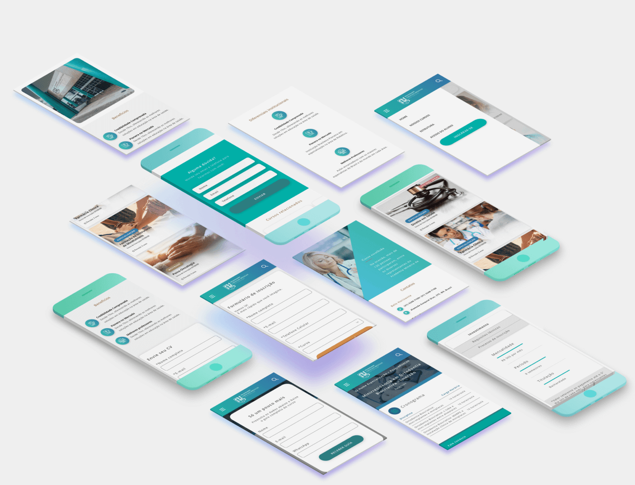
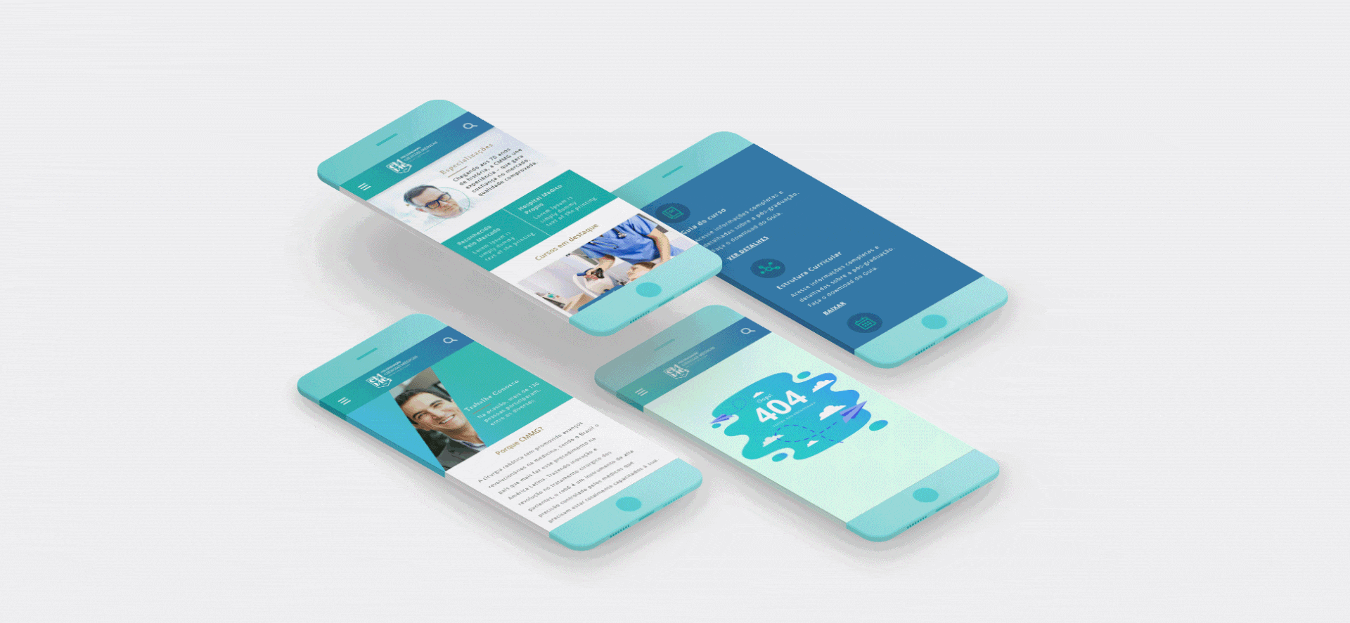
06. High-Fidelity Prototypes & collaboration with devs
Throughout the entire design process, the developers were deeply involved, collaborating closely with me at every step. Their input was invaluable—they constantly provided recommendations and insights on what was technically feasible, which helped shape practical and efficient design solutions.
Creating the high-fidelity screens was a detailed and time-consuming task, but the effort paid off with polished, user-friendly results that balanced aesthetics and functionality perfectly. To ensure smooth communication and alignment, I built an interactive prototype that clearly demonstrated user flows and interactions.
The handoff process was thorough: I organized a dedicated meeting with the development team where I walked them through the designs, answered questions, and discussed any potential challenges. This close collaboration ensured the project moved forward seamlessly and set us up for successful implementation.