Logo

Introduction

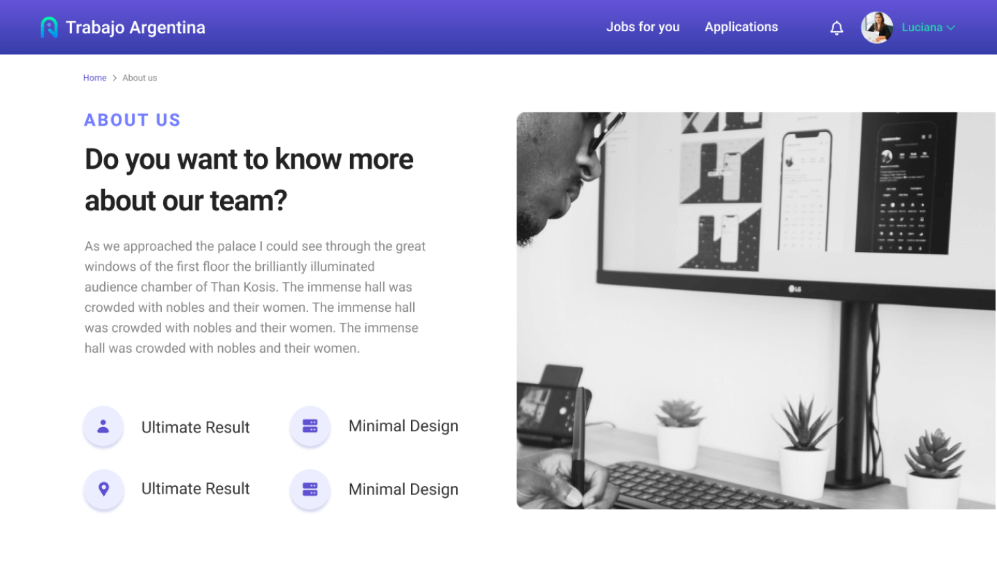
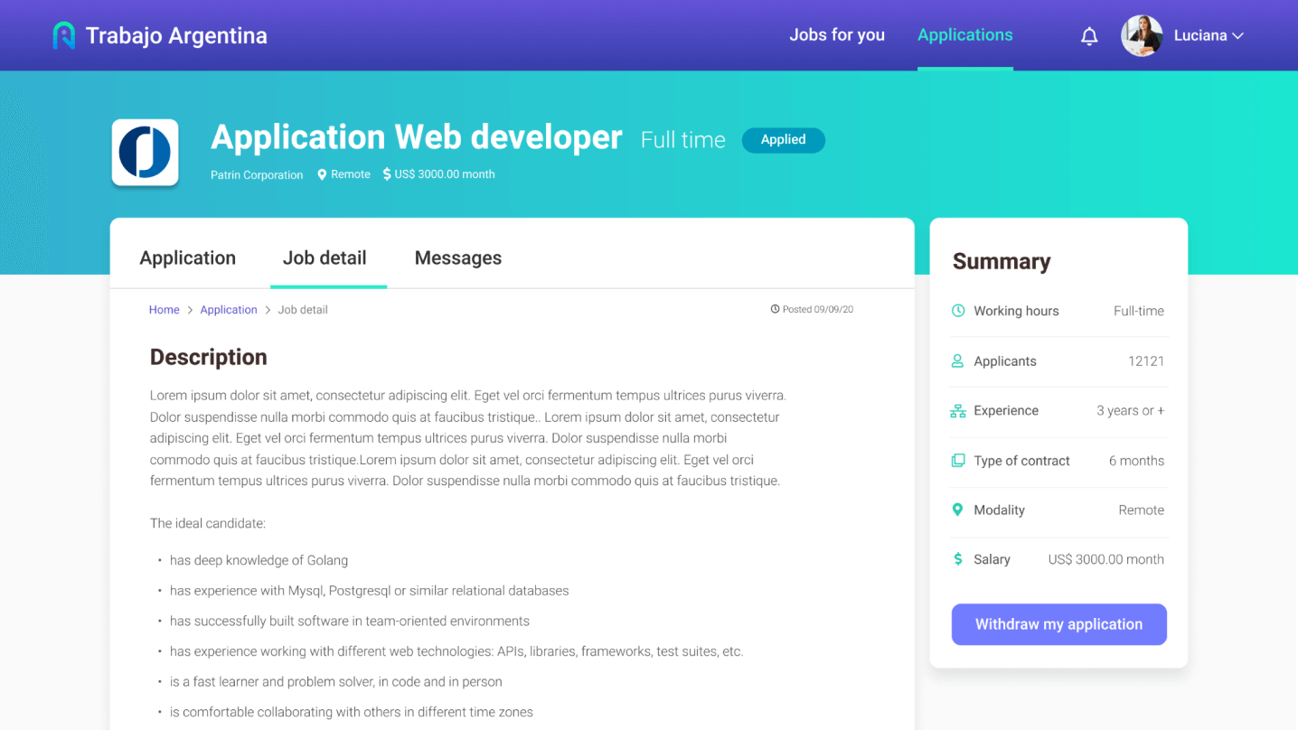
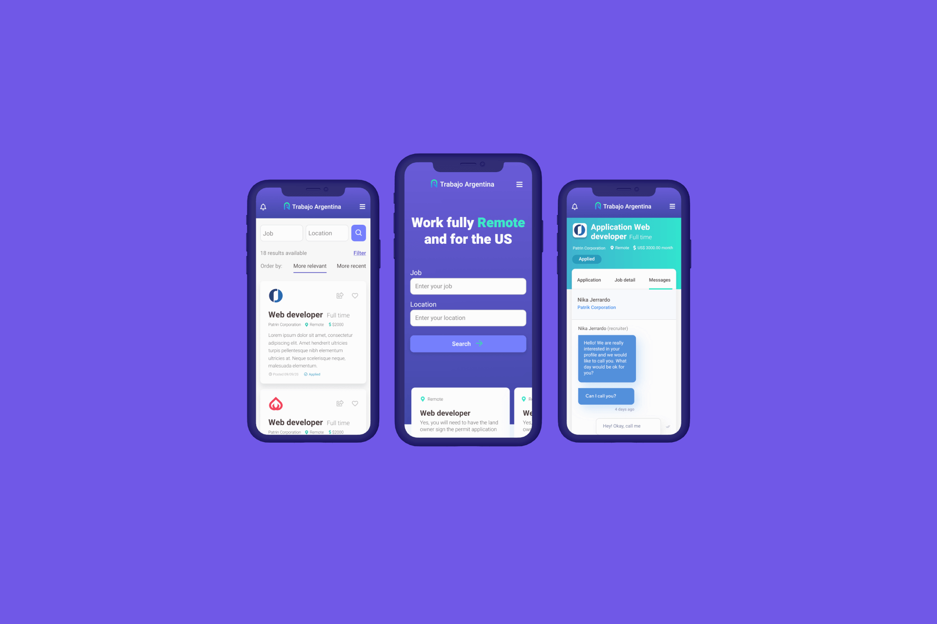
“Trabajo en Argentina” is a SaaS job platform that connects job seekers in Argentina with U.S.-based recruiters. It runs on a subscription model for recruiters, who pay to post job listings, manage candidates, and access a curated pool of talent across Argentina, while job seekers use the platform for free. I led a complete UX/UI redesign to improve usability, modernize the interface, and ensure a seamless experience for both user groups, with a focus on clear navigation, responsive design, and accessibility.

1. Discovery & Research

I began by conducting interviews with stakeholders to understand their product vision and business objectives. This helped align the project goals and frame the redesign scope.

Afterwards, I did a heuristic evaluation of the original site to identify usability issues, navigation gaps, and areas for improvement. To better understand current trends and user expectations in the remote job market, I carried out competitive benchmarking with platforms such as FlexJobs, We Work Remotely, and Remote OK. These platforms provided valuable insights into how remote-first services present job listings, support global hiring, and tailor the experience for both job seekers and international recruiters.

Mock up showing recruitment platform

2. User-Centered Design Approach

Through empathy mapping and defining user needs, I was able to uncover key frustrations and pain points that users commonly face during their job search experience. These included the lack of filtering options when browsing listings, overwhelming and cluttered job descriptions, and poor mobile responsiveness that made navigating the platform difficult. This process helped me step into the users’ shoes and understand not only what they were doing, but also what they were thinking and feeling during their interaction with the product.

image
Some Empaphy Maps

Building on the insights gathered from empathy mapping, I identified four distinct user personas; two representing job seekers and two representing recruiters. For the job seekers, I focused on recent graduates entering the workforce and mid-level professionals looking to advance or transition in their careers. On the recruiter side, I created personas for both startup hiring managers and corporate recruiters, each with unique goals and challenges in the hiring process. These personas helped guide design decisions by ensuring the product experience was tailored to the specific needs, motivations, and pain points of both sides of the job marketplace.


3. Sitemap & Information Architecture

To ensure intuitive navigation and improve overall usability, I created a new sitemap that reorganized the platform’s structure into more streamlined and user-friendly sections. This step was key in laying the foundation for a better user experience.

Key improvements included:
  • Clearer Content Hierarchy: Reorganized pages and categories to reflect user priorities, such as job search, profile management, and recruiter tools.

  • Simplified Navigation Flow: Reduced the number of clicks needed to reach essential features, improving both desktop and mobile usability.

  • Separation of User Paths: Defined distinct user journeys for job seekers and recruiters, ensuring that each group can easily access relevant tools and content.

4. Wireframes & Prototyping

Following the new sitemap, I began designing low-fidelity wireframes. Once the wireframes were validated, I defined a cohesive design system, including the color palette, typography, and image patterns. These foundations guided the creation of high-fidelity mockups and responsive layouts across viewports.

UI Design

I opted for a clean and modern aesthetic with a calm color palette, clear typography, and strong visual hierarchy to support accessibility and improve readability. The interface was designed to be fully responsive across mobile, tablet, and desktop devices.

Once the high-fidelity designs were complete, I developed an interactive Figma prototype to simulate key flows, enabling usability testing and feedback collection. After doing iterations based on user and team feedback, I organized the design system, components, and specs clearly within Figma to streamline the developer handoff.


5. Quality Assurance & Design QA

After development, I conducted a thorough Quality Check to ensure the implementation matched the original designs. This included visual consistency (colors, spacing, typography), responsiveness, and interaction fidelity.

Accessibility was also a key focus, I reviewed contrast ratios, keyboard navigation, and interaction cues to ensure an inclusive experience. Any discrepancies were documented and resolved through close collaboration with the dev team, ensuring a high-quality final product.


image
Short GIF of the Jobseeker profile

Final Outcome

The redesign of "Trabajo en Argentina" resulted in a significantly enhanced user experience for both Argentine job seekers and U.S.-based recruiters. The new platform not only meets modern usability standards but also supports the platform’s business goals of growing its international presence and increasing recruiter subscriptions.

  • Intuitive job filters and categories that help users find relevant opportunities efficiently

  • A modern and consistent UI that elevates trust and brand perception

  • Optimized mobile usability, ensuring full functionality and comfort on all devices

  • Clear calls to action and a streamlined application flow that reduces friction and encourages engagement

The platform now delivers a professional, accessible, and globally-minded experience, tailored to its unique user base. Thanks to a structured UX process — from research and architecture to prototyping, developer collaboration, and QA — the final product is not only visually compelling but also scalable, user-focused, and ready to support future growth.